
Corporate Design
The GWH logo
The basic shape of the GWH logo is the square. The symbol conveys stability, seriousness and calm. The design is clear and timeless.
A brand protection area was defined so that the logo has enough free space. It corresponds to one third of the logo size. When placing the logo, at least this protective space must be observed, but it can also be larger.

Logo variants
Special forms of the logo
For the sake of graphic design and depending on the intended use, logo variants without the slogan "Räume zum Leben" (spaces for living) may also be used. This is often the case in social media (where the white logo with an even bolder outline is used), but also applies to print and in general when the legibility of the slogan is compromised.
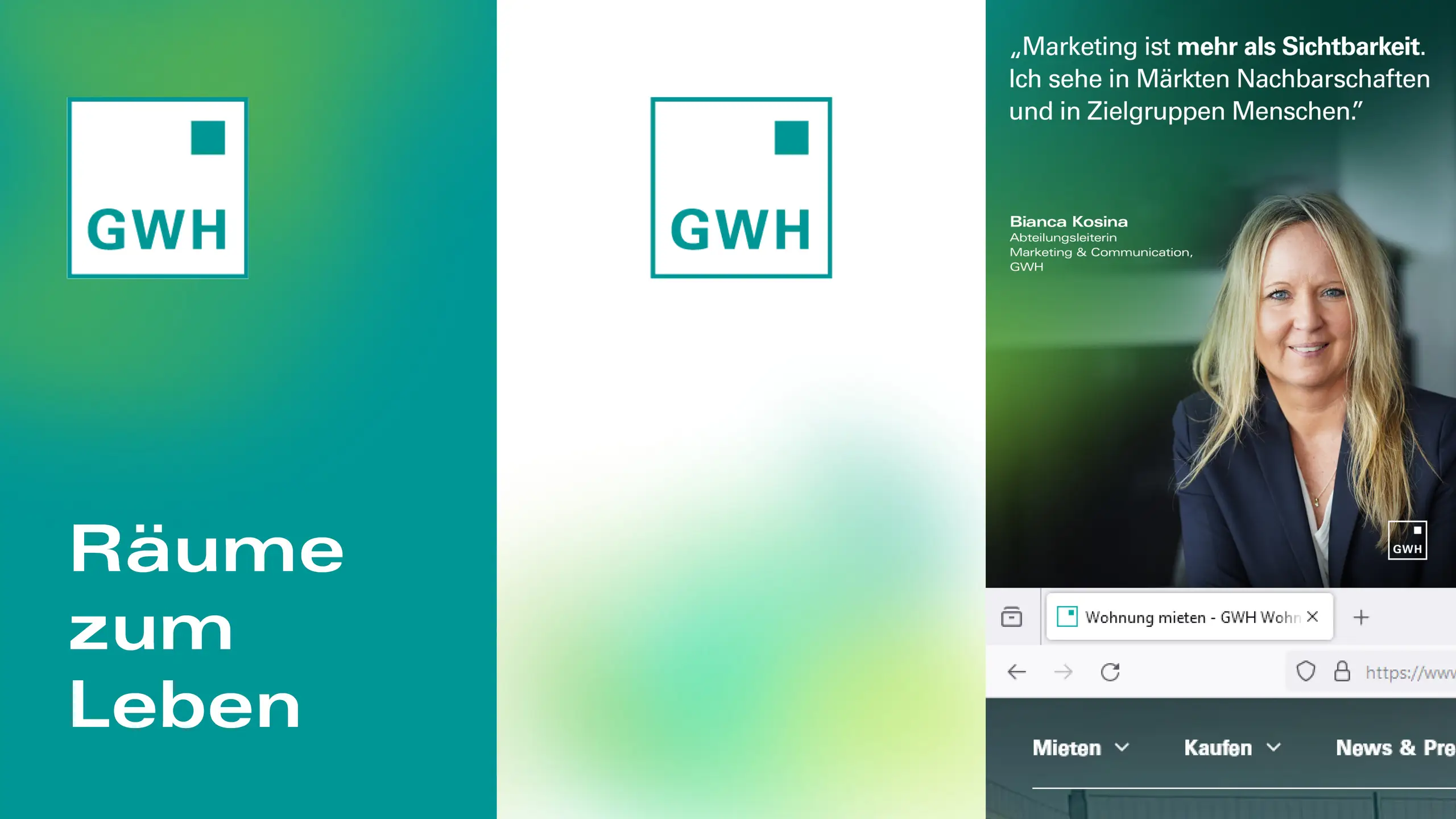
The brandicon is the most extreme form of logo reduction. In this version, the letters GWH are omitted in addition to the claim. The brand icon is only used when the legibility of the three letters is at risk. This is the case, for example, with the so-called favicon in the address bar of Internet browsers.
Logo Don't
Logo Don't
1. The logo must maintain an aspect ratio of 1:1 and must not be compressed.
2. The logo must not be stretched.
3. The logo must not be used without a border.
4. The logo may only be used in GWH green or white.
5. The basic logo on a GWH green background should be avoided: the logo border must remain visible.
6. The claim must not be deleted from the standard logo. There is a logo variant without the claim for this purpose!
